Composition of paintings with examples
Either you understand composition and know how to apply it, either you feel the proportions or not.
New posts
New video! Don't miss it!
Patinka Man patiko!
111
Patiko
straipsnis? Man patiko!
straipsnis? Man patiko!
111
2015 September 22
Teksto autorius: Evelina
For an ordinary citizen composition of paintings is endlessly difficult task and I’ve been invited to come to compose lots of pictures to customers’ homes for many times.
Indeed, I never had some special rules – either you understand composition and know how to apply it, either you feel the proportions or not. I believe that all those rules which the Internet is overloaded with do not help usually. There are so many lessons there: from the simplest lessons how to combine pictures in accordance to topics and how to choose frames for them up to 10 hanging ways. In any case, if you want to apply any rule, you need to feel space and take things that are around into account and many other things.
The only rule that is worth learning is that pictures must be hung at eye level, but it is logical anyway, no? And the bigger pictures that you hang, the bigger retreat should be there so that we could see what is represented there.
Well, I have read one more valuable advice which I would never thought of, however, I always intuitively apply: the composition of pictures cannot be wider than the thing that is under. Composition of pictures when they are hung one next to another (one under another) trying to justify them in all ways is usually not right and look really boring for me personally. But a little bit about everything.
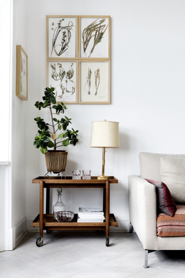
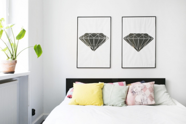
Equal paintings by size and way of hanging
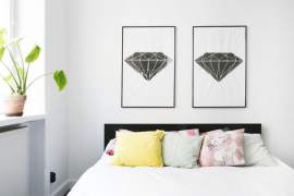
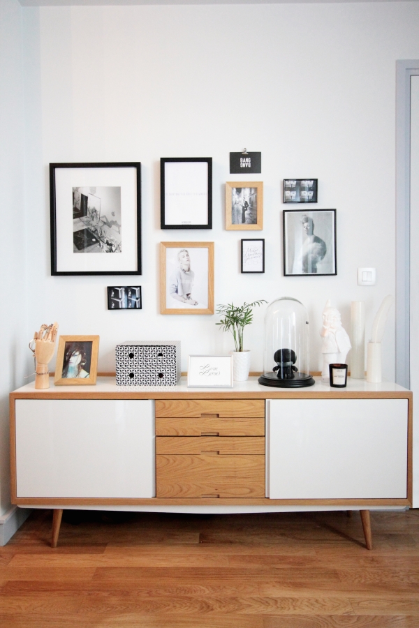
A composition in these photos look perfect and I can tell you why. Due to the small number of pictures that are combined. I justify up to 3 pictures that are hung neatly, however, the higher quantity balances on a limit of bad composition and you will now see why. In addition, these pictures are perfectly combined in their topic and frames.
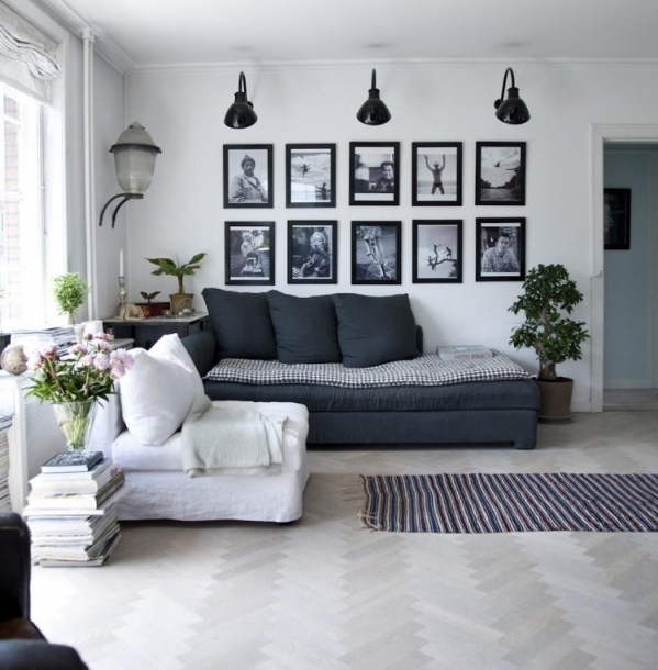
Bad examples
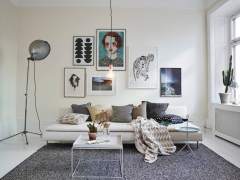
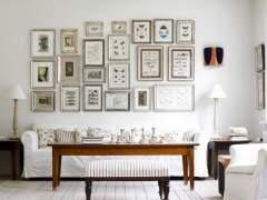
I guess that you will ask why they are bad? There is clearly too much of black color in the first one (frames, picture content, illuminators and sofa with pillows). Such composition when 5 pictures are arranged in two lines is very boring and overloads space. The second interior looks better, however, such a big quantity of pictures is simply asking for untidy composition, especially when the left corner obviously lacked height and it turned into not a very nice way. If you are already trying to arrange everything into a neatly organized rectangle please ideally close that rectangle with no balance.
A little messy composition
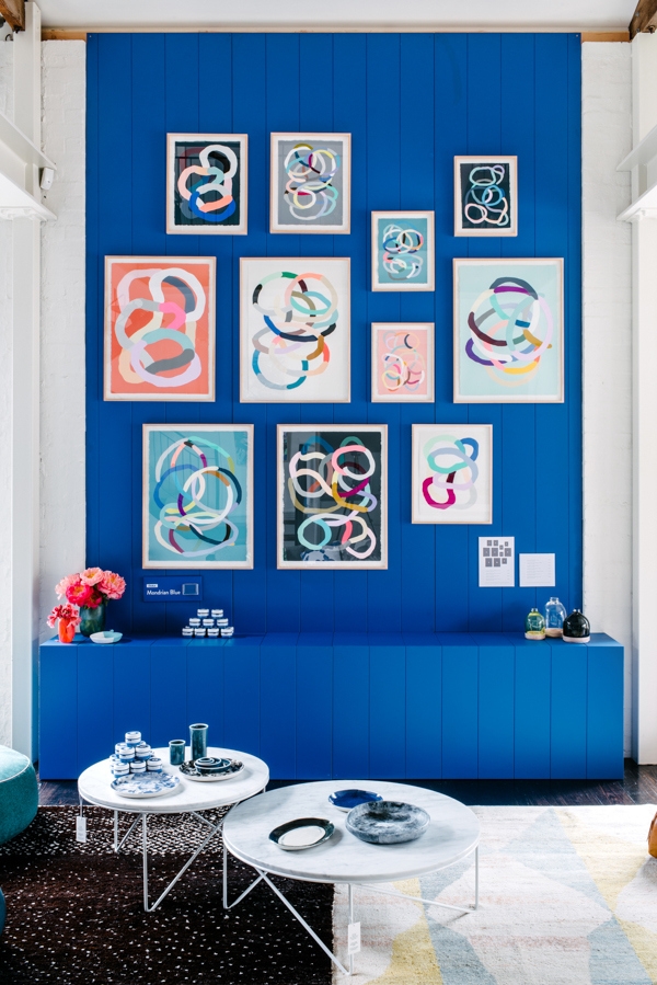
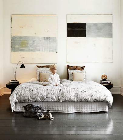
Composition of paintings looks very neatly arranged, however, the dynamic is felt at the same time. The first example is full of symmetry, however, the composition is not very symmetric at the same time (moreover, when you click on a link you will see other works of the author of those pictures which are very interesting). The second composition is perfectly arranged where every other column is repeated, i.e. the first one and the third one is made of the pictures of bigger format and the second and the fourth one – of smaller pictures. Well, and pictures themselves are wonderfully justified in places but I’m not going to make you tired with my rhetoric. I’m saying that I don’t guide the rules but now I’m simply forced to analyze and it’s possible to find certain patterns.
apartmentevolution.wordpress.com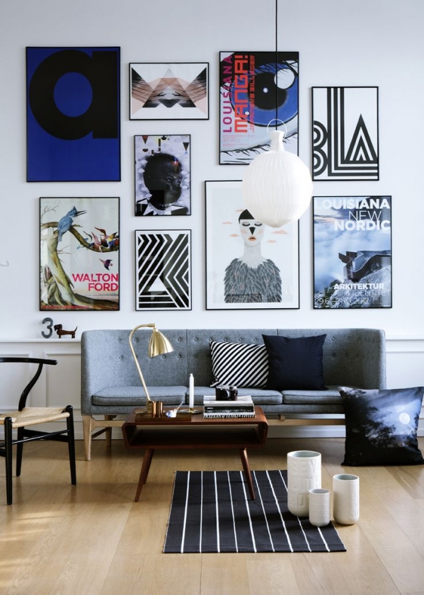
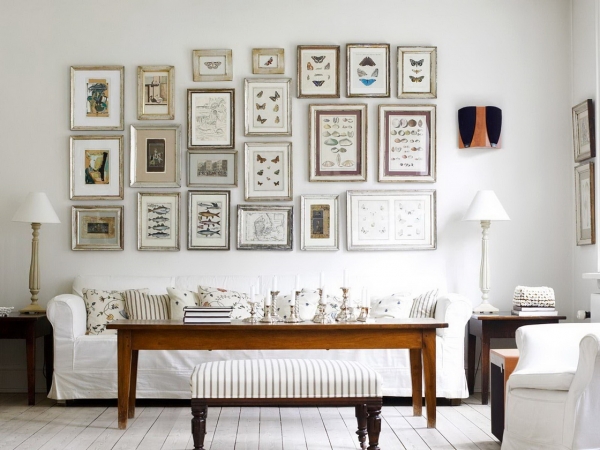
Very messy arrangement
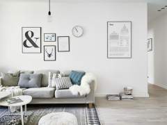
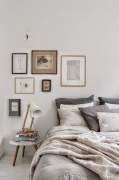
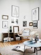
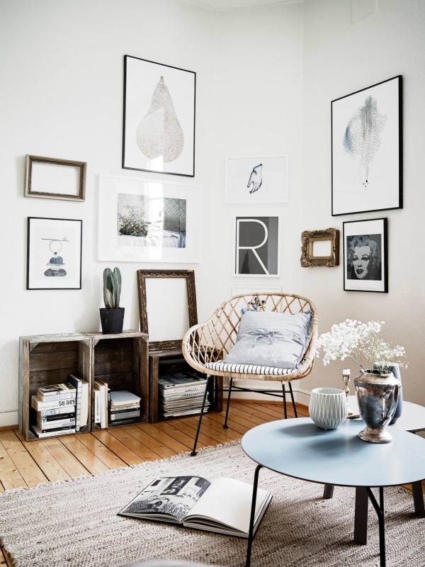
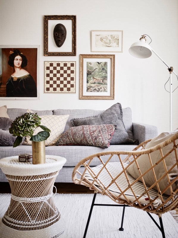
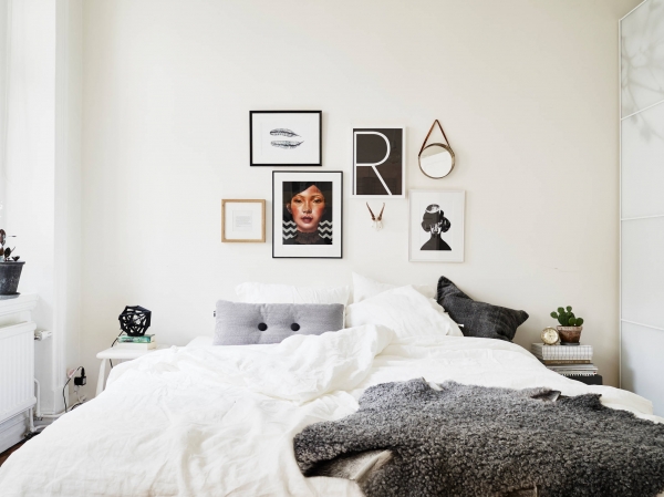
Those compositions are the most beautiful and the coziest to me. So that it was achieved the especially good sense of composition is needed because there is a lot of job to combine the pictures of different styles and topic. I’ve noticed that such chaotic compositions are characteristic to Scandinavian style, but that is not a surprise – the interiors of this style usually have some chaos in themselves and a lot of various lovely details and accessories where a chaotic composition indeed ‘arranges’ a room a little bit.
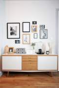
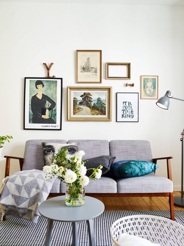
One more very nice thing is to combine pictures with other things, for example, empty frames, clocks or other things that must be hung on walls. This looks very organic.
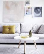
There is a very nice example how a picture can figure a composition of the whole room. If there was no right picture there, there would simply be empty space on the wall that is unused purposefully and books and magazines that are under provides perfection to all that.
Teksto autorius
Other Evelina's posts
Teksto autorius
Other Evelina's posts
Related posts
Copyright © 2012-2026 E-interjeras.lt















Comments
Sonata
Jei ant sienos norisi vienos didelės drobės, kaip apskaičiuoti tinkama dydį? Iš kur galima atsisiųsti repeodukcijų?
(0) · (0) · Reply · 2020 November 21