
Intense warm and dark colors reduce the space visually.
Teksto autorius: Evelina
This time I am going to speak about colors in interior. I‘ll begin with the simplest things. Therefore, you all probably know that all colors are divided into chromatic and achromatic. Achromatic colors – white, grey, black – in total up to 200 shades (!). Well, and chromatic ones are all the rest of the colors which make a color spectrum (there are no achromatic colors in it). Colors can also be divided into cold, warm, light and heavy but I am not going to go deeper into this topic.
There are some pieces of advice which will probably help you while thinking which color to choose when creating an interior:

The color red reaches its brightest tone in a black background, whereas a square in a white background looks more colorless. The same can be said about the color red in an orange background: red looks a bit dimmed, whereas it clears up in an azure background. A square looks not only brighter, but also larger in a black background, which is completely different from other pictures.
The color red creates a positive energy, induces associations with constrain or aggressiveness, disassembles coziness, is used when one wishes to excite and attracts one‘s attention. It is likeable among self-centered children. It provides energy and optimism for communication, induces creativity, it is not really suitable for implementation of ideas, but perfect for presentations. This color can help to focus in an office. It increases an appetite in a kitchen, therefore, is extremely loved in cafes and restaurants.
The color red-orange – the most exotic color, it bothers one‘s concentration. The cold red – the perfect color for reflections and concentration. It speeds up a heart work and increases temperature. A lot of red can make a negative influence over time. The color red is not appropriate in places where there are a lot of people: in elevators, psychiatric hospitals, meditation, rest and children‘s rooms and in bedrooms. The color red will look most harmoniously when surrounded by achromatic colors and combining it with wood.


The color yellow stimulates a brain work, increases an appetite and vital capacity – it is the color of real wishes. This color is not appropriate to use in bathrooms, night clubs, restaurants, cafes and small rooms. It is appropriate in kitchens, halls, highlighting the dark corners and especially in work places and offices (according to scientific research, information on a yellow background is much more memorable). The color yellow provides more light to an interior optically.


The color green – a strong therapeutic, calming effect, it inspires confidence and helps to deal with irritability. It is suitable in rest and recreation rooms, beauty salons and educational institutions, light green – in advertisements and emerald green color is perfect in children‘s room. If there is too much of the color green, it can start stressing you. The pure green is not a proper color in game rooms and offices.


The color blue – an insight and intuition color, it reduces an appetite (for those who want to eat less, it is recommended to eat from a blue crockery). This color is perfect for sportive and aggressive people. It doesn't fit in dining rooms, entertainment places and for quiet people who are prone to depression. It can be used in bathrooms because it creates an impression of cleanness. It is also suitable in small rooms.


The color brown is likeable in each room together with its different shades. It creates a sense of comfort, complements other colors and induces associations with stability and security. While combining it with other colors, you can use the color brown in all rooms, but don‘t overdo because you can be attacked by an oppressive, grumbles mood. The color brown mostly appears in an interior not directly, but through various materials (wood, bricks).


Grey – a subtle, harmonious, neutral and tranquil color. It perfectly suits for official rooms. It combines with all colors, thus, if you match the color grey with any bright color, you will definitely soften a situation visually. Too much of grey can induce a feeling of boredom. I have to say that it is very difficult to draw the boundaries where grey is treated as the color black and where simply a shadow of the color white.


White – probably the most universal color (not only a pure white, but also its shades are meant) which symbolizes comfort, piece, cleanness and sterility. The color white was always attractive to Scandinavian interior designers. Even though the color white is treated very impractical, it is extremely likeable.
The color white is unique because it lets one create practically any style interiors – from minimalistic to the classic ones, however, it is not recommended to use a lot of white in a bedroom – it destroys an intimate mood. Carefully choose lighting in a white interior – shadows are brighter and much more intense here.
White is irreplaceable in small rooms where lighting is poor, for example, in a bathroom or a small kitchen. Another positive feature of this color – it is a perfect background for bright interior details. The only disadvantage of the color white (as well as all other light colors) is that it can become dirty easily. It is especially relevant when we speak about soft furniture.


There are some examples, how bright colors look in a white background.


Black is a stylish and high-quality color which has some kind of indescribable luxury in itself and will definitely find its place in each interior. It reduces space visually and perfectly goes with glossy surfaces. It could even be said that the color black is equal to white considering its universality, however, there is a great difference in mood – perhaps nobody doubts that too much of black stresses and causes negative emotions. The only piece of advice would be to use black in moderation, to combine it with other colors and pay a particular attention to lighting. As long as the color black absorbs light, it can seem dark in a room in a day time if there is not enough natural light.


My name is Evelina Aleliūnienė. I'm founder of this blog and interior designer. Writing this blog helps me while doing this kind of job and is a great bundle of beautiful ideas for you!
My name is Evelina Aleliūnienė. I'm founder of this blog and interior designer. Writing this blog helps me while doing this kind of job and is a great bundle of beautiful ideas for you!
Related posts


NET 84
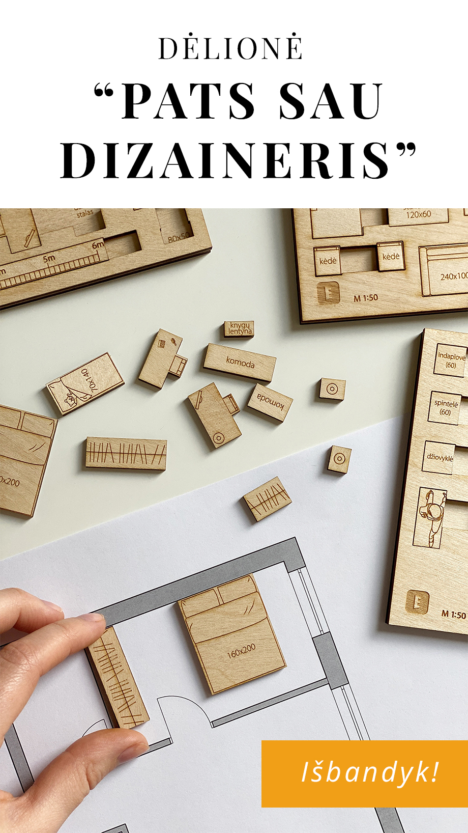
BALDŲ IŠDĖSTYMO PLANAI!
Tik tiems, kurie prenumeruos naujienlaiškį. Visi planai atlikti interjero dizainerės Evelinos Aleliūnienės.
Jeigu naujienlaiškį jau prenumeruojate, tiesiog įveskite savo duomenis dar kartą. Jeigu esate naujas prenumeratorius, turėsite patvirtinti prenumeratą.


Comments